
The Makeover Monday for week 12 is about How do we really feel about women leaders?
Original Visualization:

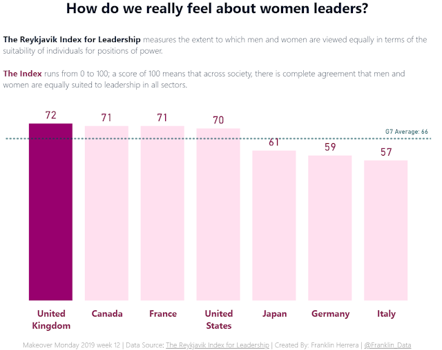
What works well?
- Using the same color of the company.
- Using a different color for the G7 Average.
- Ordering the countries by index amount.
What could be improved?
- Using a different type of chart, like a bar chart or column chart for easy comparison.
- Changing the title of the chart as a question.
What I did?
- Used the same color of the company for association.
- Used a column chart to facilitate the comparison with the G7 Average.


No comments:
Post a Comment