
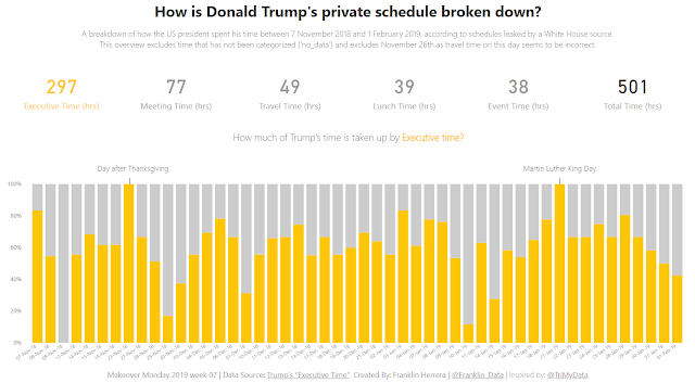
The Makeover Monday for week 7 2019 is about Donal trump's private schedule. A White House source has leaked nearly every day of President Trump's private schedule for the past three months (7 November 2018 and 1 February 2019).
I realize that I had never worked with a dataset with time and I thought It would be easier just sum the time in 00:00:00 format. But, it did not work. So, I took the time column and I multiply it by 24.
Original Visualization:

What works well?
- Adding a clear title.
- Including the source of the data.
- Using orange to highlight the executive time.
- Adding values labels.
- Adding the Total Time at the bottom of the chart.
What could be improved?
- I do not have any point to add here, I like the chart to be honest.
What I did?
- This time I have emulated Eva Murray's visualization. The original viz it is awesome and I wanted to learn how to create that in Power BI. I could not do the same with the x axis, but, I did my best. Thanks Eva for sharing this awesome viz to the community.


No comments:
Post a Comment